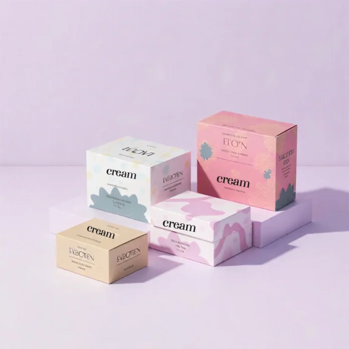
When a customer in the US picks up your product, the color of your cream boxes is the very first thing they experience. But printing isn’t as simple as picking a shade on a screen; it involves strategic decisions that affect cost, consistency, and final look. This guide breaks down the four main color options available when you order custom cream boxes so you can make the perfect choice for your brand.
Why Color Decisions Define Your Cream Packaging
The colors you select for your packaging are not just decorative; they are a silent spokesperson for your cosmetic line, setting the tone and brand identity immediately. A bright, accurate color signals quality and professionalism. Our goal here is to give you a clear, simple review of the four main printing methods available, ensuring your finished cream packaging is exactly what you thought about it.
1. What CMYK Means for Your Cream Box
CMYK is the most common process for color printing. The letters stand for Cyan, Magenta, Yellow, and Key (Black). This is a four-color process where the press layers microscopic dots of these four inks in different percentages and patterns to create millions of colors, the exact same way a standard inkjet printer works.
This method is ideal for complex design elements. If your custom printed cream boxes feature detailed product photos, subtle color gradients, or intricate artwork, CMYK is your go-to solution. It provides the flexibility to render photographic-quality images directly onto the surface of your box.
2. When to Use PMS (Pantone) for High-Volume Cream Boxes
PMS, or the Pantone Matching System, is entirely different from CMYK. Instead of mixing four colors, PMS uses pre-mixed, standardized, exact “spot colors.” Think of it as mixing a specific can of paint before it ever reaches the press.
This is critical because it guarantees absolute color consistency. For companies ordering cream boxes wholesale across multiple production runs, PMS ensures your brand’s specific blue or red will look identical every single time, regardless of the printer or location. It is the gold standard for maintaining exact color fidelity on logos and key brand elements, making it essential for established brands.
3. Adding Luxury Shine to Printed Cream Packaging Boxes
If you want your printed cream packaging boxes to convey luxury or capture attention on the shelf, you need to look beyond standard inks. This category includes vibrant fluorescent (neon) inks or the sophisticated shine of metallic colors like gold, silver, or copper.
These colors are typically achieved in one of two ways: they are either applied as specific Pantone metallic spot inks or, more commonly, for a richer look, through foiling (hot stamping). Foiling presses a thin metallic film onto the cardboard, giving your custom cream boxes a true metal shine and a high-end texture that cannot be replicated with standard ink.
4. Holding the Natural Look for Cream Packaging
Sometimes the best color choice is the simplest: using the natural color of the packaging material itself. This involves choosing not to “flood-print” the entire box with an opaque color, allowing the raw stock color to shine through.
This approach is highly popular for eco-friendly or organic brands using natural brown Kraft stock, which automatically communicates sustainability and an earthy feel. It is simple, cost-effective, and often results in striking, minimalist cream packaging boxes when paired only with black or white text.
Ready to bring your cosmetic vision to life? From ensuring your brand colors are Pantone-perfect to selecting the right eco-friendly stock, the packaging experts at We Print Boxes provide the best cream boxes on the market. Contact us today for a custom quote!
FAQs
Can I combine CMYK and PMS in one design?
Yes, absolutely. It’s very common to use CMYK to print a complex background or a product image, and then use PMS for a crucial element like the brand logo to guarantee that specific color is perfect. Be aware that running both processes will increase the cost per unit.
Does the material choice affect the final color?
Yes, significantly. If you print on Natural Brown Kraft, the underlying brown tone will make all CMYK colors look slightly muted or darker. For the truest color result, printing on a bright white cardboard stock is always recommended, as it allows the inks to pop exactly as intended.
Which option is best for small-batch custom cream boxes?
For lower-volume and small-batch orders, digital CMYK printing is usually the fastest and most cost-effective method. PMS requires setting up plates, which is more economical only when scaled up for large-volume runs.


